A little more room to work with.
The Consumer Attorneys Association of Los Angeles (CAALA) knows how to put on a convention. For its 2025 event at the Wynn in Las Vegas, attendees would be greeted by an 80-foot-wide, 10-foot-tall LED wall.
That's a pretty impressive welcome. It's also a lot of real estate to fill.
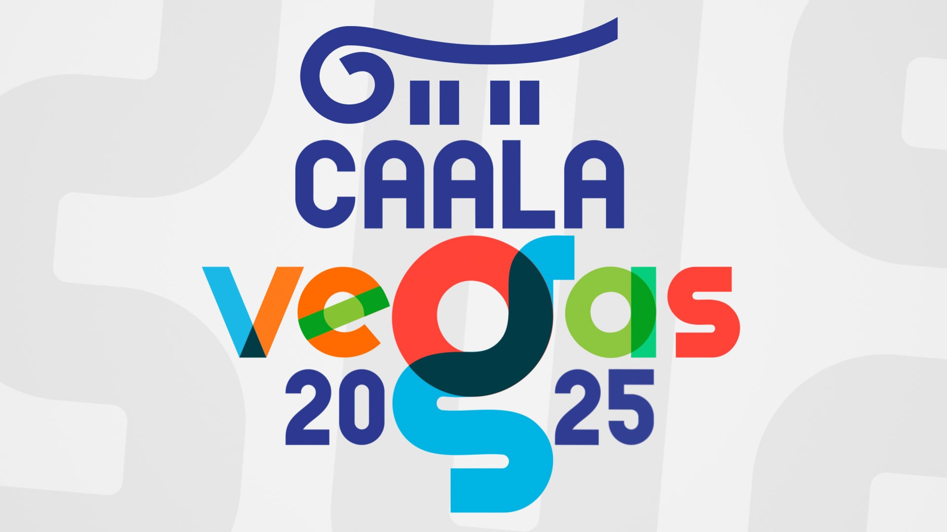
CAALA already had an established look for the event, including its colors, typography, textures, and overall visual style. My job wasn't to come up with something new. It was to take what they'd already created and make it feel right at a scale considerably larger than the usual website, brochure, or presentation screen.
And make sure it could run throughout the day without anyone noticing where it started or stopped.
Bigger isn't always better.
Especially when it's just bigger.
The temptation with a screen that size is to make everything enormous, add some motion, and call it a day. But an 80-foot display doesn't behave like a regular monitor.
Text needs to be readable from across a convention space. Sponsors need their moment without competing with everything else. Colors that look great on a laptop can become overwhelming when they're lighting up an entire wall.
And with an ultra-wide resolution of 8,640 × 1,080, conventional layouts weren't going to translate particularly well.
The trick was giving everything enough room to breathe while keeping the presentation interesting, recognizable, and consistent with the rest of CAALA's event materials.
Making it all fit. And flow.
I built the animation in After Effects, using the established CAALA theme as the foundation rather than trying to put my own stamp on it.
The presentation moved between event highlights, branded sequences, and sponsor showcases. Each needed a little variety to keep things interesting, but not so much that it felt like several different people had designed them.
I paid particular attention to composition, typography, color, and pacing. Bright whites and heavily saturated colors needed some restraint, while smaller design details had to be reconsidered for a screen where little imperfections weren't going to stay little.
Then there was the loop.
Since the animation would be running continuously, the ending needed to lead naturally back into the beginning. No abrupt jump, no obvious restart, and ideally no reason for anyone to wonder how many times they'd already seen it.
Right at home at the Wynn.
The finished animation brought CAALA's established visual identity into a much larger environment, with event messaging and sponsor recognition incorporated into one continuous presentation.
And we got to see it in action.
The graphics were tested on the actual LED wall, giving us the opportunity to check how the composition, typography, and visual details translated from the editing suite to the convention floor.
It wasn't about introducing a new look. It was about making the existing one work somewhere it hadn't been before, without losing what made it recognizable in the first place.
Sometimes creative work calls for a completely new idea.
Other times, the challenge is knowing what not to change.